The centre of Linz is populated by old buildings that tell the story of this ancient town in Upper Austria. Architectural testimonies starting from the Middle Ages, then developing into the Baroque period and reaching the glories of the Hapsburg Empire.
And on the top floor of one of these 18th century dwellings there is a recently renovated apartment, owned by an Austrian entrepreneur working in the property sector.
In view of his upcoming marriage, he has bought and completely renovated this old apartment to turn into his new love nest.
A place to live in complete harmony with his young wife and the children they hope to have as soon as possible…
The renovation work was extensive and completely revolutionised the inside areas of the house. The entrepreneur wished to split the apartment into two completely independent areas.
A quiet and peaceful sleeping area with three bedrooms, a study and a bathroom are in the back part of the house overlooking the calm internal courtyard.
The living area has been moved into the front of the building overlooking the Danube and the tree-lined river front that runs alongside it. A really unique view that was made to be exploited!
To make the living area even brighter and show off the view from all the windows, all of the dividing walls have been knocked down. This has created a large open space encompassing the dining area and the visible kitchen.
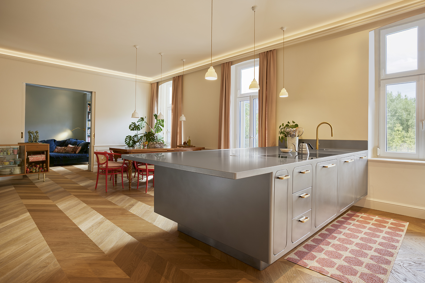
To connect the dining room better, which was originally separated by a load-bearing wall, a large passage has been created, opening onto the dining-kitchen area through two sliding doors.
The result is a single, warm and comfortable area, where the owners, both excellent cooks, love hosting friends, chatting and cooking for them.
This solution is the young couple’s dream come true. A large living area that evokes the atmosphere of traditional Austrian homes where the kitchen has always been the heart of the home.
Precisely for this reason, in their mind, the kitchen needed to be large, visible and welcoming. But that’s not all. They wanted a kitchen that could offer them the same performance levels as a professional kitchen, but that was at the same time attractive to look at and enjoy every day. Both during intimate domestic times and during the numerous meals and parties that the owners frequently organise.
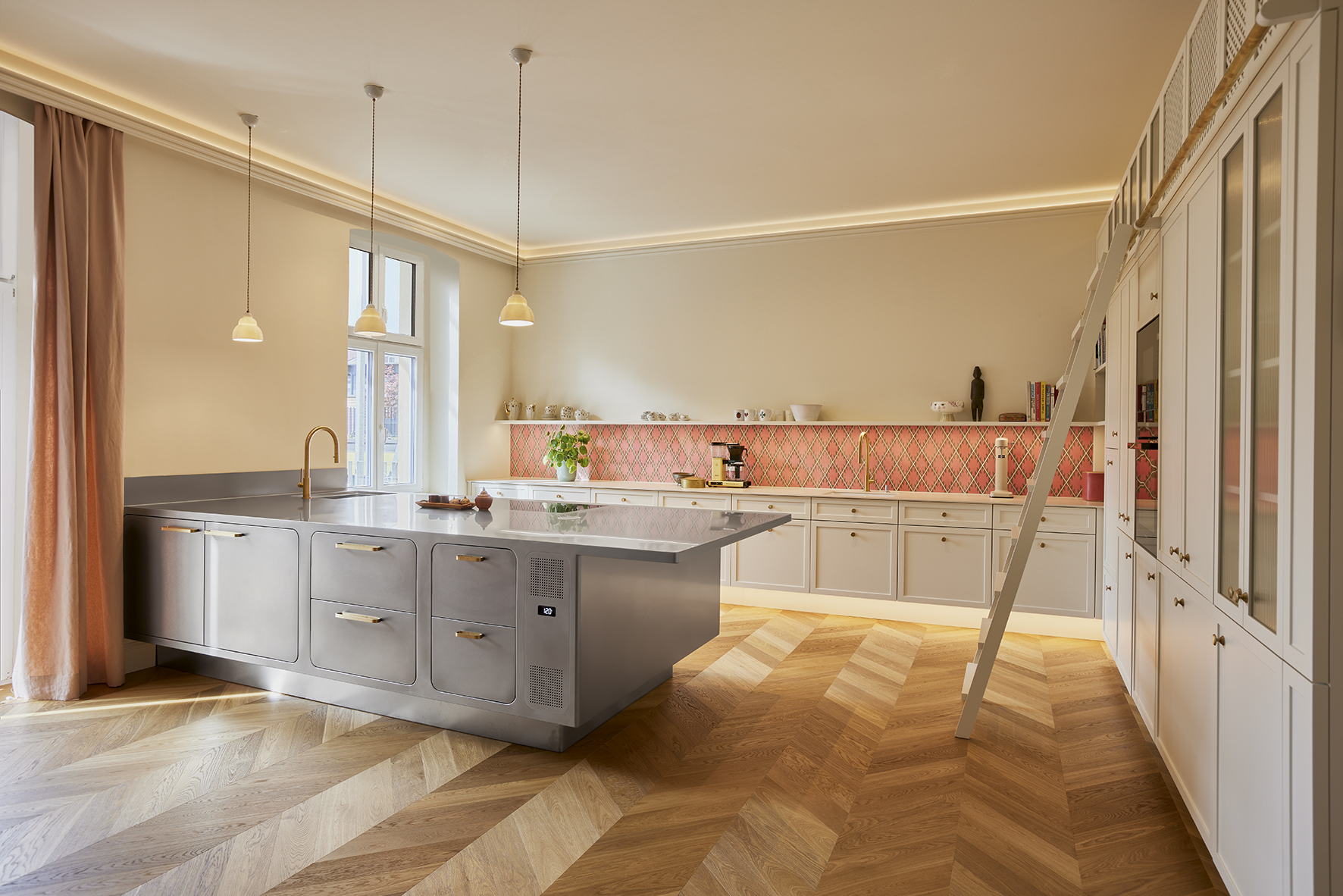
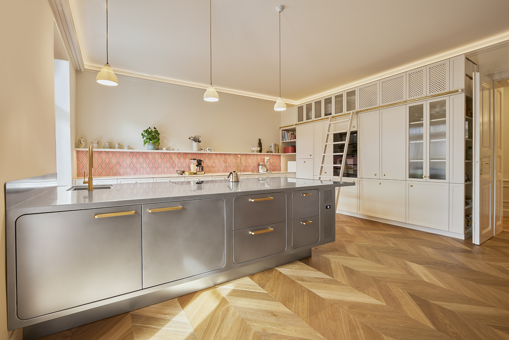
To make the living area fit perfectly with the kitchen, the latter has been split into 3 distinct areas. Two have been made of lacquered wood in ivory tones, so as to give the room a warm homely atmosphere. And in the centre of the room, to create a stark contrast with the wooden furniture, a large stainless steel peninsula element has been made by Abimis.
The first element, positioned on the back wall, is a large “wall to wall” kitchen block which includes the washing area and a long series of containers. The backdrop is created by a collection of ancient traditional Austrian pink majolica tiles.
On the side wall, opposite the windows, the second element has been installed, reaching the ceiling and housing 2 ovens, the fridge area and a cabinet with various windows.
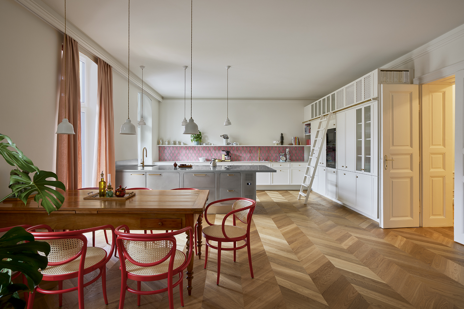
And on the opposite side is the living area, furnished with a large extendable late 19th century wooden table surrounded by the most classic Thonet armchairs. They have traditional lines, a curved beech structure and Viennese straw seats, but fanciful colours, with lacquered wood in an unusual red.
The oak floor, installed in a herringbone pattern, contributes to making the environment uniform, running continuously from the living area to the dining area and as far as the kitchen.
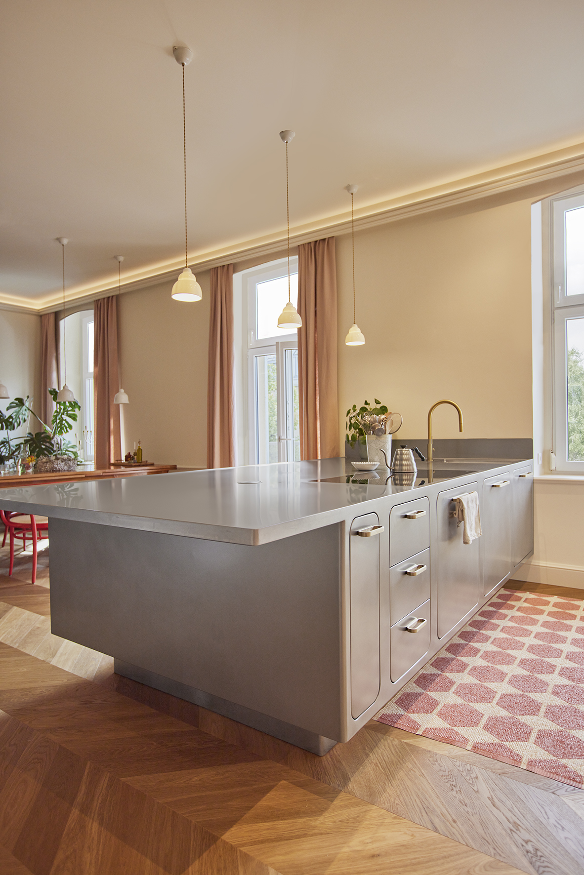
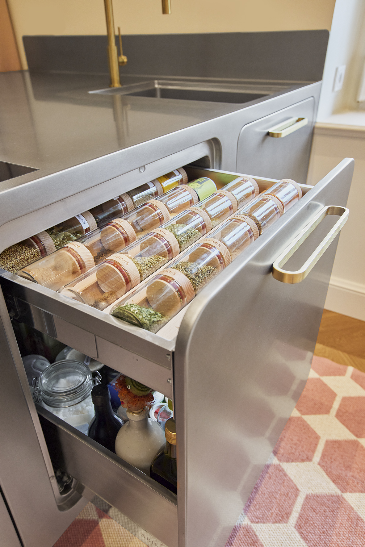
In the centre of the room, the large peninsula kitchen Ego by Abimis is the main feature in orbitally polished stainless steel. A completely hand finished surface which gives the steel a warmer and finer tone.
A “bold” finish chosen by the owner to give the room more character, otherwise dominated by the white tones and honey colour of the parquet floor.
The architect, who saw to every step of the renovations, including the furnishings, recommended the Ego model by Abimis. And he did so for various reasons.
Primarily for practical reasons.
Abimis exclusively makes kitchens to measure which can all be completely customised. And this enabled the designer to express his creativity to the full.
The second reason is functional. Abimis professional-derived kitchens offer the same performance levels as those of starred restaurants while being designed for domestic use. This is so that the owners can express their “culinary” skills to the max.
And, last but not least, for aesthetic reasons.
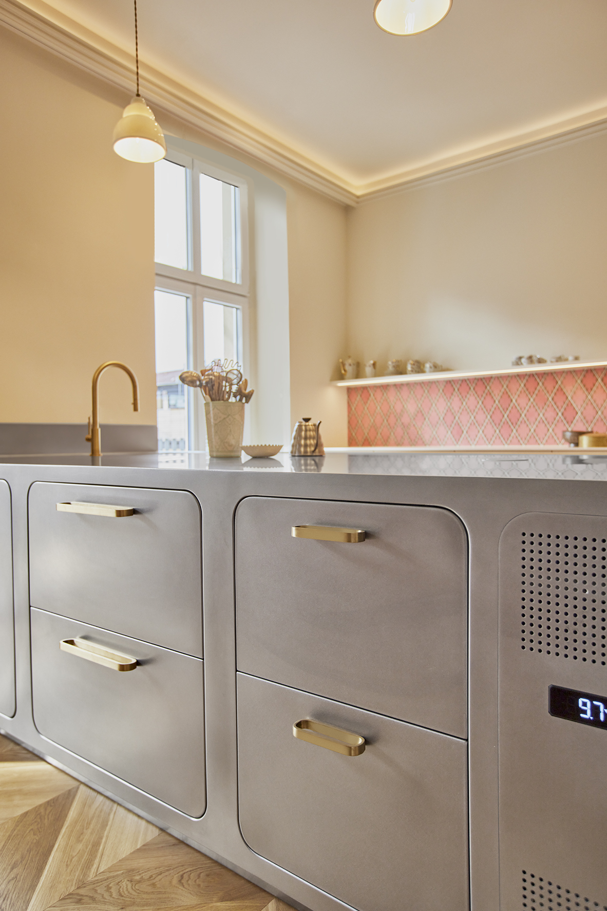
In fact, Ego is a kitchen with a design that is reflected in every tiny detail, whose soft lines, inspired by the 1950s, are highlighted by the rounded profile of the doors.
A desire for beauty that has reconciled the couple’s aesthetic tastes and those of the architect.
The Ego peninsula by Abimis is in turn split into 2 functional areas. On the inner side, the cooking area and a second sink, both set flush into the top.
And on the side facing the living area, as well as the traditional containers, the owner has also added two cooling drawers for wine and beer.
So friends can easily grab a drink for themselves whenever they like, during sociable times together. Another extra touch to make guests feel at home…
